Wednesday, 9 February 2011
EVALUATION: Question 4
How did you use media technologies in the construction and research , planning and evaluation?
EVALUATION: Question 3
What have you learned from your audience feedback?
EVALUATION: Question 2
Ancillary texts
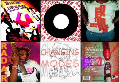


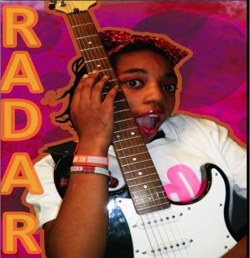
The combination of the ancillary text (panel from the digipak) is effective with the video as it clearly promotes the lead singer with the use of composition. The singer is denoted with a close up and is centre within the digipak, reinforcing her importance within the band. This would also be effective for the audience as they can recognise band through the main singer. However this goes against the convention of the indie genre where the band is usually present within the digipak and not focused on one member. The difference between the ancillary and the video is that the lead singer is not denoted playing an instrument , however it does give the impression that she play the guitar within the album.
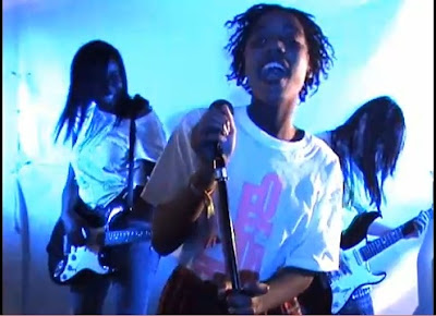

The above is a screen grab from the video, while below is a panel from the digipak. The two images denote same the costume, where the same typograpghy is used. This does conform to the indie genre where a band would have quirky typograpghy on their clothing within their merchandise. However this could also been seen as subverting the convention that indie bands don't usually promote through their video. This would be effective for the target audience as they would enticed to buy the t-shirt as the band wears them, in so promoting cross media and creating star persona for the band.
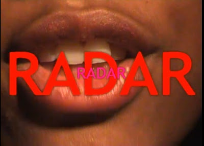
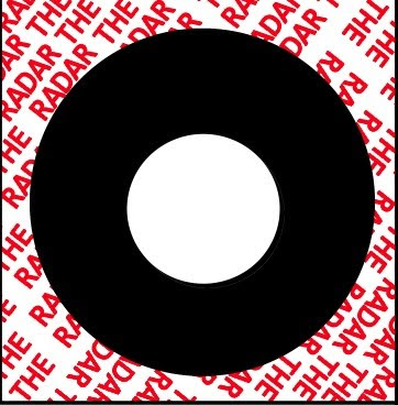
This is an effective combination of the two products as the both consist of the same typography and colour. This not only reinforces the band house style of bright colours and bold fonts, but also promotes the track within the album. We decided to use the colour red as it is attention grabbing, reflecting the band's music. This is also effective for the audience as the consumer will instantly recognise the repetition of the word 'The Radar' which references repetition of the word at the end. The difference is that we deliberately chose different colours within the video to make it more visually interesting, instead of repeating the same red colour.
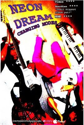

Although the band in the poster are denoted lying on the floor, we decided that in the video that they would be performing standing. We felt this gives the poster an edge and makes it more distinct from the video. We also decided to use a more light saturated effect and colours of red and pinks as it is more eye grabbing than the blue lighting in the video. It would of created a more cooler, colder effect to the poster, which is not what we wanted to present.
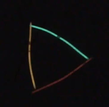

Another difference between the ancillary and the video is that we decided not to included the glowsticks within the ancillary. We decided that including the glowsticks would make the ancillary too 'busy' with the bold colours already present. However we maintained the house style of the band of bright colours and bright lighting which also appears within the video.
EVALUATION: Question 1
In what ways does your media product use, develop, or challenge forms and conventions of real media products?
Subscribe to:
Comments (Atom)